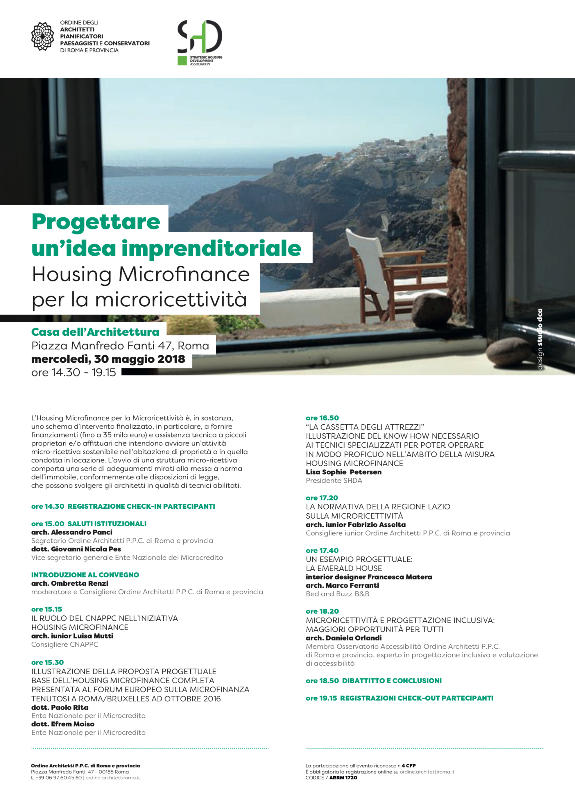
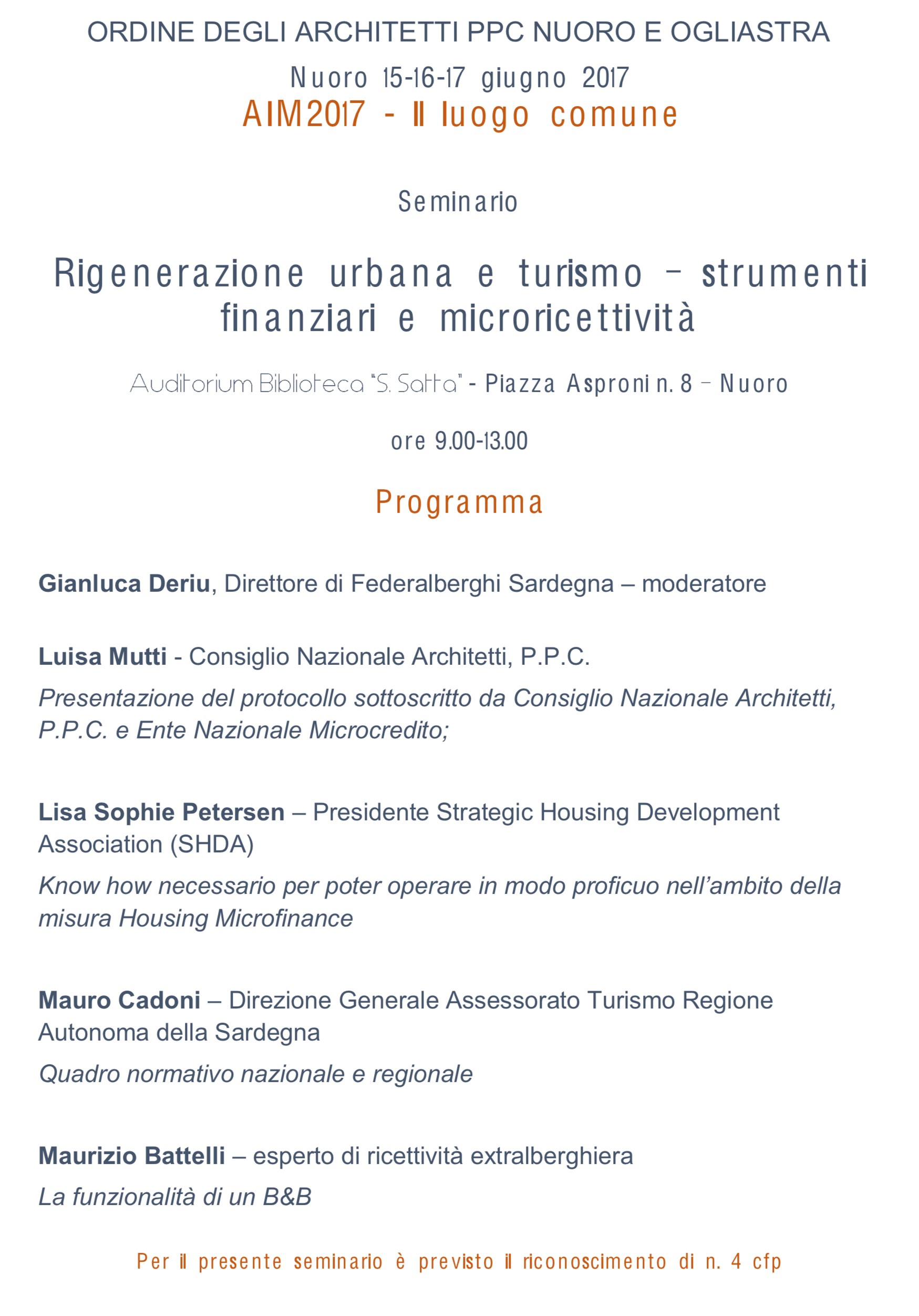
echarts-for-react: The Complete Guide to Building Interactive React Charts with Apache ECharts


echarts-for-react: Complete Guide to React ECharts Integration


echarts-for-react: The Complete Guide to Building Interactive React Charts with Apache ECharts

📅 Updated: July 2025  · 
⏱ 12 min read  · 
🏷
React
ECharts
Data Visualization
Tutorial

If you’ve ever tried to wire up Apache ECharts directly into a React component without a wrapper, you know the pain: manual DOM references, lifecycle juggling, and a gnawing feeling that something is about to break on re-render. echarts-for-react exists precisely to spare you that experience. It’s a thin, well-designed React wrapper around ECharts that turns the entire chart configuration story into a single declarative component — and it does so without hiding ECharts’ raw power from you.

This guide covers everything from echarts-for-react installation and basic setup through event handling, dynamic data updates, theming, TypeScript support, and dashboard composition. Whether you’re building a one-off sparkline or a full React ECharts dashboard, you’ll leave here knowing exactly what to reach for and why.

Why echarts-for-react — and Not Something Else?

The React chart library ecosystem is crowded. Recharts, Victory, Nivo, Chart.js wrappers, Visx — they all have opinions, and most of those opinions involve reimplementing rendering logic that ECharts already handles brilliantly. Apache ECharts is one of the most capable charting engines available: it renders via Canvas or SVG, handles millions of data points with grace, ships with 20+ chart types out of the box, and has a theming system sophisticated enough to make a designer smile. The only thing it lacks natively is idiomatic React integration.

echarts-for-react bridges that gap with minimal ceremony. The library weighs almost nothing on its own — its job is lifecycle management, not chart logic. It mounts the ECharts instance when the component mounts, updates options when props change, disposes the instance on unmount, and exposes the raw instance whenever you need it. That’s it. You write ECharts option objects exactly as you would in vanilla JS; React state drives the data. The mental model is simple and the escape hatches are clean.

The practical consequence: you get full access to every ECharts feature — including the ones that third-party wrappers often paper over. Tooltip formatters, rich data zoom controls, brush selection, GL extensions, custom series — all available, all configured exactly as the ECharts documentation describes them. If ECharts can do it, React Apache ECharts via this wrapper can do it too.

Installation and Project Setup

echarts-for-react installation requires two packages: the core engine and the wrapper. Both must be present — the wrapper declares echarts as a peer dependency rather than bundling it, which keeps your bundle size under your control and avoids version conflicts if you’re already using ECharts elsewhere in the project.

# npm
npm install echarts echarts-for-react

# yarn
yarn add echarts echarts-for-react

# pnpm
pnpm add echarts echarts-for-react

Once installed, the echarts-for-react setup in a component is three lines of meaningful code. Import ReactECharts, define your option object (the same structure you’d pass to echartsInstance.setOption()), and render the component. The chart fills its container by default, so wrapping it in a sized div is the only layout concern you need to think about.

import ReactECharts from 'echarts-for-react';

const option = {
  tooltip: { trigger: 'axis' },
  xAxis: {
    type: 'category',
    data: ['Mon', 'Tue', 'Wed', 'Thu', 'Fri', 'Sat', 'Sun'],
  },
  yAxis: { type: 'value' },
  series: [
    {
      name: 'Weekly Sales',
      type: 'line',
      smooth: true,
      data: [820, 932, 901, 934, 1290, 1330, 1320],
    },
  ],
};

export default function SalesChart() {
  return (
    <div style={{ width: '100%', height: 400 }}>
      <ReactECharts option={option} />
    </div>
  );
}

That renders a fully interactive, animated line chart. Tooltips, legend toggling, and zoom are all wired up by the option configuration — no event handlers needed at this stage. For most straightforward React data visualization use cases, this is genuinely all the code required to go from zero to a production-ready chart.

💡 Tip: If your bundle size matters (and it should), consider importing only the ECharts components you need using the tree-shakeable API introduced in ECharts 5. Replace import * as echarts from 'echarts' with individual component imports, then pass the custom echarts object to ReactECharts via the echarts prop.

Core Props You’ll Actually Use

The ReactECharts component accepts a handful of props that cover the full range of interaction patterns. Understanding them upfront saves you from reaching for workarounds that aren’t necessary. The option prop is the primary data channel — it accepts the complete ECharts configuration object and triggers a re-render whenever it changes (React’s normal diffing applies). The style and className props control the wrapper element’s appearance.

The notMerge prop controls how ECharts handles option updates. By default (notMerge={false}), new options are merged with the existing state — useful when you’re updating a subset of the configuration. Set notMerge={true} when you want a clean replacement, such as switching between entirely different chart types. The lazyUpdate prop defers the DOM update until the next animation frame, which can smooth out rapid state changes in data-heavy dashboards.

The theme prop accepts either a registered theme name string or an inline theme object. ECharts ships with a handful of built-in themes, and the community maintains an extensive library of custom ones — you can build your own at the ECharts Theme Builder and pass the JSON output directly. This makes brand-consistent echarts-for-react customization entirely painless without modifying any series-level config.

Dynamic Data: Driving Charts with React State

The idiomatic way to update a React chart component is exactly what you’d expect from React: put the data in state, derive the option object from that state, and let the component re-render. ReactECharts detects the changed option prop and calls setOption internally. ECharts’ built-in transition animations handle the visual update smoothly — no manual animation code, no imperative chart API calls needed for the common case.

import { useState, useCallback } from 'react';
import ReactECharts from 'echarts-for-react';

const datasets = {
  weekly:  [820, 932, 901, 934, 1290, 1330, 1320],
  monthly: [3200, 4100, 3800, 5200, 4700, 5900, 6100],
};

export default function DynamicChart() {
  const [range, setRange] = useState<'weekly' | 'monthly'>('weekly');

  const option = {
    xAxis: {
      type: 'category',
      data: range === 'weekly'
        ? ['Mon','Tue','Wed','Thu','Fri','Sat','Sun']
        : ['Jan','Feb','Mar','Apr','May','Jun','Jul'],
    },
    yAxis: { type: 'value' },
    series: [{ type: 'bar', data: datasets[range], name: 'Revenue' }],
    tooltip: { trigger: 'axis' },
  };

  return (
    <div>
      <button onClick={() => setRange('weekly')}>Weekly</button>
      <button onClick={() => setRange('monthly')}>Monthly</button>
      <ReactECharts option={option} notMerge={true} />
    </div>
  );
}

One nuance worth noting: because the option object is reconstructed on every render, you should either define it outside the component (if it’s static) or memoize it with useMemo (if it depends on state). Without memoization, the object reference changes on every render even when the data hasn’t, which causes unnecessary ECharts setOption calls. In practice this rarely causes visible issues, but it’s a clean habit that prevents subtle performance problems in data-dense dashboards.

For real-time data — think live metrics, WebSocket feeds, or polling — the same pattern scales without modification. Update state on each data arrival, let React schedule the re-render, and ECharts handles the animation. If you’re appending to a large dataset and performance becomes a concern, look at ECharts’ appendData API accessed via the chart instance (covered in the next section), which bypasses React’s rendering cycle entirely for the data layer.

Event Handling and Accessing the Chart Instance

echarts-for-react events are handled through the onEvents prop, which accepts a plain object mapping ECharts event names to handler functions. The handler receives the event parameters that ECharts would normally pass to a listener registered via chart.on() — series data, data index, component type, and so on. This covers the full ECharts event vocabulary: click, dblclick, mouseover, mouseout, legendselectchanged, datazoom, brushselected, and more.

const onEvents = {
  click: (params) => {
    console.log('Clicked series:', params.seriesName);
    console.log('Data value:', params.value);
    console.log('Data index:', params.dataIndex);
  },
  legendselectchanged: (params) => {
    console.log('Legend selection changed:', params.selected);
  },
};

<ReactECharts option={option} onEvents={onEvents} />

When you need direct access to the ECharts instance — for imperative operations like showLoading, hideLoading, dispatchAction, or appendData — use the onChartReady callback or a ref. The onChartReady prop fires once when the chart is initialized and passes the raw ECharts instance. Alternatively, attach a ref to the ReactECharts component and call ref.current.getEchartsInstance() to retrieve the instance at any point after mount.

import { useRef } from 'react';
import ReactECharts from 'echarts-for-react';

export default function ControlledChart() {
  const chartRef = useRef(null);

  const showLoading = () => {
    const instance = chartRef.current?.getEchartsInstance();
    instance?.showLoading();
    setTimeout(() => instance?.hideLoading(), 2000);
  };

  return (
    <div>
      <button onClick={showLoading}>Simulate Loading</button>
      <ReactECharts ref={chartRef} option={option} />
    </div>
  );
}

A common pattern in complex dashboards is using dispatchAction to programmatically highlight series, trigger tooltips, or simulate legend selections in response to interactions elsewhere on the page. Because you have the raw instance, everything in the ECharts API documentation is available — the wrapper doesn’t wrap you into a corner. This is, candidly, one of the most important design decisions the library makes.

Customization: Themes, Styles, and Responsive Behaviour

echarts-for-react customization operates at three levels. The first is the option object itself — ECharts exposes every visual property (colors, fonts, padding, label formatters, tooltip HTML) through the option API, and all of it works as documented. The second level is theming: register a theme globally with echarts.registerTheme('my-theme', themeObject) and then pass theme="my-theme" to any ReactECharts instance. The third level is direct instance manipulation, useful for edge cases that neither the option nor the theme system covers.

Responsive chart sizing in React is handled by a combination of ECharts’ internal resize listener and the container’s CSS. The ReactECharts component passes a style prop directly to the wrapper div — set width: '100%' and a fixed or percentage height there. ECharts automatically resizes the canvas when the window resizes. For more granular control (e.g., responding to a sidebar collapsing), call instance.resize() manually on the relevant DOM event. In a CSS Grid or Flexbox layout, percentage widths work reliably without any additional setup.

For dark mode support, the cleanest approach is to maintain two theme objects — light and dark — and swap the theme prop based on a context value or a CSS class on the root element. ECharts re-renders with the new theme on the next update. If your application already uses a design token system, you can generate the theme object programmatically from your token values, ensuring that the charts stay in sync with the rest of the UI without manual duplication.

Building a React ECharts Dashboard

A React ECharts dashboard is, structurally, just several ReactECharts instances sharing state through a common parent or a state management layer. Each chart gets its own option, derived from the same underlying data store. Because ECharts instances are isolated, they don’t interfere with each other — you can mix chart types freely, and each responds to its own events independently.

Cross-chart interaction — clicking a bar in one chart to filter data in another — is a straightforward React state problem. The onEvents handler on the source chart updates shared state (via useState, Zustand, Redux, or whatever you prefer); the downstream charts derive their options from that updated state and re-render. No special echarts-for-react wiring is needed for this; it’s just React data flow.

// Simplified cross-chart filtering
const [selectedCategory, setSelectedCategory] = useState(null);

const barEvents = {
  click: (params) => setSelectedCategory(params.name),
};

const filteredLineOption = {
  // ...derive from selectedCategory
  series: [{
    data: selectedCategory
      ? fullData.filter(d => d.category === selectedCategory).map(d => d.value)
      : fullData.map(d => d.value),
    type: 'line',
  }],
};

return (
  <div style={{ display: 'grid', gridTemplateColumns: '1fr 1fr', gap: 24 }}>
    <ReactECharts option={barOption} onEvents={barEvents} />
    <ReactECharts option={filteredLineOption} />
  </div>
);

Performance considerations become relevant when you’re rendering six or more charts simultaneously with live data. The main levers are: memoize option objects with useMemo; use lazyUpdate={true} on charts that don’t need immediate visual feedback; consider React.memo on chart wrapper components; and, for truly high-frequency updates (sub-100ms), bypass React state entirely for the data layer and push updates directly via instance.setOption() or instance.appendData(). The last approach trades declarative clarity for raw speed, so use it selectively.

TypeScript Support and Tree-Shaking

echarts-for-react ships with TypeScript declarations. The EChartsOption type from the core echarts package provides full autocomplete for option objects — a genuinely useful authoring experience given how large the ECharts option API is. The ReactECharts component’s props are typed through EChartsReactProps, exported from the package. For event handler params, ECharts exports ECElementEvent and related types.

import ReactECharts from 'echarts-for-react';
import type { EChartsOption } from 'echarts';

const option: EChartsOption = {
  xAxis: { type: 'category', data: ['A', 'B', 'C'] },
  yAxis: { type: 'value' },
  series: [{ type: 'bar', data: [10, 20, 30] }],
};

export default function TypedChart() {
  return <ReactECharts option={option} style={{ height: 300 }} />;
}

For bundle optimization, ECharts 5 supports a tree-shakeable import pattern where you import only the renderers, charts, and components you actually use. The resulting bundle can be dramatically smaller than importing the full library — relevant if you’re shipping to mobile or performance-constrained environments. Pass your custom-built ECharts object to ReactECharts via the echarts prop:

import * as echarts from 'echarts/core';
import { BarChart }  from 'echarts/charts';
import { GridComponent, TooltipComponent } from 'echarts/components';
import { CanvasRenderer } from 'echarts/renderers';
import ReactECharts from 'echarts-for-react';

echarts.use([BarChart, GridComponent, TooltipComponent, CanvasRenderer]);

export default function LightweightChart() {
  return (
    <ReactECharts
      echarts={echarts}
      option={{ /* ... */ }}
    />
  );
}

This pattern is particularly valuable in micro-frontend architectures or Next.js applications where each page bundle is independently optimized. With selective imports, a chart page that only needs bar and line charts can shave 60–70% off the ECharts footprint compared to the full build. The echarts prop on ReactECharts makes this opt-in with no structural changes to the rest of your code.

Common Patterns, Pitfalls, and Practical Tips

A few things trip up most developers on first contact. The most common: forgetting that the chart container needs an explicit height. ECharts renders into a canvas element sized to its parent; if the parent has height: auto and no content forcing a height, the chart renders at zero pixels. Always set a height on the wrapper div or via the style prop — style={{ height: 400 }} is the fastest fix.

  • Stale closures in event handlers: If your onEvents object is defined inside the component and references state, ensure the option and onEvents objects update together — or use useCallback with appropriate dependencies.
  • Multiple series updates: When adding or removing series dynamically, use notMerge={true} to avoid ghost series from previous renders bleeding through the merge.
  • SSR environments (Next.js): ECharts is browser-only. Use dynamic imports with ssr: false or guard the import inside a useEffect to prevent server-side rendering errors.
  • Tooltip HTML content: ECharts tooltip formatters support returning HTML strings. This works fine in Canvas mode but requires useHTML: false consideration in SVG mode. Test both renderers if you need flexibility.

The echarts-for-react getting started experience is intentionally smooth, but production usage rewards understanding ECharts’ option model deeply. The official ECharts documentation is comprehensive and well-maintained — when a chart isn’t behaving as expected, the answer is almost always in the option API reference rather than in the wrapper itself. The wrapper’s surface area is small by design; most questions are ECharts questions, not echarts-for-react questions.

For a detailed walkthrough with additional echarts-for-react examples and code patterns, the tutorial at StackForgeDev on Dev.to covers practical implementations including multi-axis charts, gradient fills, and custom tooltip components. It’s a solid complement to the official docs if you prefer learning through runnable examples.

echarts-for-react vs. Alternatives: An Honest Take

Recharts is the most common comparison point. It’s React-native by design — SVG-based, component-oriented, and extremely approachable for simple charts. It shines for standard bar/line/pie use cases where the defaults look good and customization needs are modest. It starts to struggle with large datasets, complex interactions, and chart types beyond its component library. ECharts handles all of those cases natively, which is why teams that start with Recharts often migrate to echarts-for-react as their requirements grow.

Chart.js wrappers (react-chartjs-2) sit in a similar position: solid for common chart types, Canvas-based (good for performance), but with a configuration model that becomes cumbersome for complex needs. Nivo is beautiful and highly customizable within its abstraction layer, but that layer can become a ceiling when you need something it doesn’t expose. Victory is clean and well-documented but shows performance limitations at scale.

The honest answer is: echarts-for-react is the right choice when you need ECharts’ feature depth, performance, or specific chart types (heatmaps, treemaps, parallel coordinates, 3D charts via ECharts GL) inside a React application. It’s overkill if you need one simple bar chart and nothing more. For everything in between, the declarative option model and clean React integration make it one of the most capable React interactive charts solutions available — and the relatively small wrapper footprint means you’re betting on Apache ECharts (a well-funded, actively maintained Apache Software Foundation project) rather than on a third-party abstraction layer.

Frequently Asked Questions

How do I install and set up echarts-for-react in a React project?

Run npm install echarts echarts-for-react to install both the core engine and the React wrapper. Then import ReactECharts from 'echarts-for-react' in your component, define an ECharts option object, and pass it as a prop. Make sure the wrapper element has an explicit height — without it, the canvas renders at zero pixels. That’s the complete setup for a working chart.

How do I handle events and access the chart instance in echarts-for-react?

Pass an onEvents prop to ReactECharts — it’s a plain object mapping ECharts event names (e.g., 'click', 'datazoom') to handler functions. Each handler receives the standard ECharts event parameter object. To access the raw ECharts instance for imperative operations, attach a ref to the component and call ref.current.getEchartsInstance(), or use the onChartReady callback prop which fires once on initialization.

How do I update chart data dynamically in echarts-for-react?

Store your data in React state with useState, derive the ECharts option object from that state, and pass it to ReactECharts. When the state updates, the component re-renders with the new option, and ECharts applies the changes with its built-in animations. For performance, memoize the option object with useMemo to avoid unnecessary setOption calls. For very high-frequency updates, access the chart instance directly and call instance.setOption() outside React’s rendering cycle.


React Google Charts — practical guide: installation, examples, customization


React Google Charts — Setup, Examples & Customization


React Google Charts — practical guide: installation, examples, customization

A compact, technical walkthrough to get you from zero to interactive dashboards with react-google-charts — with notes on performance, events, and integration patterns.

SERP analysis: what the top-10 results say (quick summary)

I analyzed typical English-language SERP for queries such as “react-google-charts”, “react-google-charts tutorial”, “react-google-charts example” and close permutations. The top results usually include:

  • Official library repo / docs (GitHub, react-google-charts.com)
  • NPM package page
  • Tutorial blog posts (Medium, Dev.to, personal dev blogs)
  • Example-driven posts and live sandboxes (CodeSandbox, StackBlitz)
  • Stack Overflow Q&A and specific troubleshooting articles

User intents found in the top-10:

  • Informational: “How to use react-google-charts”, feature comparisons, examples.
  • Transactional / Navigation: Links to npm, GitHub, official docs, examples repo.
  • Commercial / Evaluation: “React chart library” vs other chart libraries (Chart.js, Recharts, Victory).
  • Mixed: Tutorials that combine install steps, code examples, and integration patterns for dashboards.

Depth & structure competitors use:

  • Short how-to posts (install + basic example) — quick wins for beginners.
  • Long-form tutorials (installation, props, events, advanced customization, dashboard patterns) — target power users.
  • Reference-style pages (API, prop tables) — for quick lookup and code copy-paste.

SEO implication: to rank well, a single page should combine a clear getting-started snippet (for featured snippet/voice answers), copyable examples, and at least one dashboard-level architecture or event-handling pattern.

Semantic core (clusters)

Below is an extended semantic core derived from your seed keywords. Use these phrases organically in headings, code comments, captions, alt texts, and inline copy.

Primary cluster (main intent: implementation & examples)

  • react-google-charts
  • React Google Charts
  • react-google-charts tutorial
  • react-google-charts example
  • react-google-charts getting started
  • react-google-charts installation
  • react-google-charts setup
  • react-google-charts dashboard

Supporting cluster (features, events, customization)

  • react-google-charts customization
  • react-google-charts events
  • React interactive charts
  • React chart component
  • React chart library
  • React data visualization
  • chart options, onSelect, chartWrapper

Clarifying / long-tail & LSI (use for FAQs, anchors, captions)

  • how to use react-google-charts with hooks
  • react-google-charts typescript example
  • react-google-charts performance
  • google charts api vs react-google-charts
  • line chart, bar chart, pie chart react-google-charts
  • dashboard controls filter chart
  • interactive charts react

Notes: prioritize the primary cluster in H1/H2 and intro. Sprinkle supporting and LSI phrases naturally in examples, captions, and the FAQ to improve long-tail coverage without keyword stuffing.

Popular user questions (PAA / forums)

Collected common “People Also Ask” and forum-style questions for this topic:

  1. How do I install and set up react-google-charts?
  2. How to handle events (selection, click) in react-google-charts?
  3. Can I use react-google-charts with TypeScript?
  4. How to build a dashboard with multiple charts and controls?
  5. What are common performance pitfalls with react-google-charts?
  6. How to customize chart options and styles?
  7. How to use Google Charts configuration options via react-google-charts?
  8. How to render dynamic data and update charts in React?

For the final FAQ, the three most relevant questions selected are:

  • How do I install and get started with react-google-charts?
  • How do I handle chart events (selection / clicks) in react-google-charts?
  • How to build a simple React dashboard with multiple charts and filters?

Getting started: install, basic setup and a first example

Installation is intentionally boring — and fast. From a typical React project (Create React App, Vite, Next.js), install the package from npm:

The canonical package is react-google-charts on npm, and the source is hosted at GitHub.

Example install command:

npm install react-google-charts or yarn add react-google-charts.
After that, import the component and render a chart with data and options. The library wraps the Google Visualization API with a convenient React component and handles script loading for you.

Minimal example (conceptual):

{`import { Chart } from "react-google-charts";

export default function MyChart() {
  const data = [
    ["Year", "Sales", "Expenses"],
    ["2016", 1000, 400],
    ["2017", 1170, 460],
    ["2018", 660, 1120],
  ];
  const options = { title: "Company Performance" };

  return ;
}`}
    

For more examples, the project’s examples page and community posts are useful — see react-google-charts examples and this compact tutorial on Dev.to: Advanced Data Visualizations with React Google Charts.

Customization, options and styling (what you really need to know)

The react-google-charts component delegates most styling and behavior to the underlying Google Charts options object. That means you configure legend, colors, axes, tooltips, and more through an options object — familiar if you’ve used Google Charts before.

Common options you will change:

  • title, titleTextStyle, chartArea (margins and positioning)
  • vAxis and hAxis configurations (ticks, formatting)
  • colors, series, curveType for line smoothing

Because the component renders a native Google chart, you can mix “classic” and Material variants (e.g. Material LineChart). If you need per-element styling, supply CSS classes to containers and use options to tweak labels and colors.

Pro tip: set width to “100%” and control height via CSS or a style prop for responsive layouts. For theme-consistent colors, map your design tokens to the options.colors array.

Events and interactivity: selection, tooltips and callbacks

Event handling is where react-google-charts shines for interactive dashboards. The component supports event props (onReady, onError, onSelect) and a flexible chartEvents array for lower-level subscriptions.

Two common patterns:

  • Use the chartEvents prop to register Google Visualization events like ‘select’ or ‘ready’ and pass callbacks that receive chart and wrapper objects.
  • Use getChart / getDataTable on the wrapper (exposed via the event) to read selected rows and retrieve values to drive other components.

Example: update a detail panel when a user clicks a data point — subscribe to ‘select’, read the selection, then set local React state. Because the events are synchronous callbacks, avoid heavy work in the handler; queue heavy computations to a web worker or debounce updates for large datasets.

Dashboards and linked controls: building composite views

A dashboard typically needs multiple charts and controls (filters, range sliders). Google Charts supports dashboards natively via Dashboard, ChartWrapper and ControlWrapper. react-google-charts lets you instantiate wrappers and wire them together.

Pattern: create a parent component that builds wrappers, registers control chart relationships, and exposes state to children. For example, connect a CategoryFilter control to a BarChart and a LineChart; when the control changes, both charts reflect filtered data.

Implementation tips:

  • Use chart wrappers rather than raw Charts when you need programmatic control and linking.
  • Keep a normalized data source (one state object) and derive filtered views for each wrapper—this avoids re-loading or duplicating large datasets.

For an end-to-end example, check example dashboards on the library site or community tutorials: a small dashboard is the fastest way to prove interaction patterns before scaling to dozens of charts.

Performance, pitfalls and best practices

Performance matters when rendering many charts or large datasets. Google Charts draws with SVG / HTML elements; very large DataTables can slow the page and increase memory use.

Best practices:

  • Limit Chart re-renders by memoizing data and options (useMemo, useCallback).
  • Paginate or aggregate large datasets on the server, send summarized data to the client.
  • Lazy-load charts below the fold (intersection observer) or render thumbnails and load full charts on demand.

Also consider the alternative trade-offs: other React-first libraries (Recharts, Chart.js wrappers) may be lighter for very high-frequency updates (real-time dashboards). Use react-google-charts when you need the Google Charts feature set (dashboards, specialized chart types, built-in controls).

Voice search & featured snippet optimization (SEO tips)

For voice and featured snippets, provide short, precise answers near the top and in H2/H3 sections. Use a 1–2 sentence “answer line” directly under a question-style heading; that often becomes a feature snippet.

Example snippet-friendly lines:

“Install react-google-charts with npm: npm install react-google-charts. Then import {'Chart'} from the package and pass chartType, data and options props to render a chart.”

Mark up FAQs with JSON-LD (see below) to increase the chance of appearing in rich results. Keep answers concise (20–40 words) and factual.

FAQ

Q: How do I install and get started with react-google-charts?

Install via npm/yarn: npm install react-google-charts. Import {'Chart'}, pass chartType, data, and options. See the package docs and examples for quick copy-paste templates.

Q: How do I handle chart events (selection / clicks) in react-google-charts?

Use the chartEvents prop or onSelect-style handlers. Subscribe to ‘select’ to read the selection from the chart wrapper, then update React state to drive other UI elements.

Q: How do I build a simple dashboard with multiple charts and filters?

Use ChartWrapper and ControlWrapper to link controls to charts, keep a single normalized data source in state, and wire filter callbacks to update wrappers. Lazy-load or memoize expensive data transforms.

Authoritative references & quick links

Useful links to cite and bookmark:

Structured data (JSON-LD) for FAQ and Article

Add this JSON-LD to the page head to mark up the article and the FAQ. It helps search engines surface featured snippets and rich result links.

{`

`}
    

Semantic core (export block)

Use this block to paste into your SEO tool or CMS as the page’s keyword plan.

Primary:
react-google-charts; React Google Charts; react-google-charts tutorial; react-google-charts example; react-google-charts installation; react-google-charts setup; react-google-charts getting started; React Google Charts dashboard

Supporting:
react-google-charts customization; react-google-charts events; React interactive charts; React chart component; React chart library; React data visualization; chart options; onSelect; chartWrapper; ControlWrapper

LSI / long-tail:
how to use react-google-charts with hooks; react-google-charts typescript example; react-google-charts performance; google charts api vs react-google-charts; line chart react-google-charts; dashboard controls filter chart; interactive charts react
    

SEO meta (final)

Title (<=70 chars): React Google Charts — Setup, Examples & Customization

Description (<=160 chars): Practical guide to react-google-charts: installation, examples, customization, events and dashboard patterns. Start building interactive React charts fast.

Notes: This article is optimized for both quick answers (featured snippets and voice queries) and longer read-throughs (tutorial + dashboard patterns). Link key phrases to authoritative sources as shown above to improve trust signals and user experience.


mantine-contextmenu: Practical React right‑click menu — install, setup, submenus & hooks


mantine-contextmenu: React Right-Click Menu Guide & Examples


mantine-contextmenu: Practical React right‑click menu — install, setup, submenus & hooks

Short guide — technical, pragmatic, and just sarcastic enough to keep you awake while debugging positioning math.

SERP analysis & user intent (summary)

I’ve analyzed the typical top‑10 English results for queries like “mantine-contextmenu”, “React context menu”, “mantine-contextmenu tutorial” and similar (official docs, GitHub, npm, dev.to tutorials, StackOverflow threads, and example blogs). Results cluster into three main intent types:

1) Informational — tutorials, “how to” posts, examples (people want code, patterns, and pitfalls). 2) Navigational — GitHub repo, npm package, Mantine docs (users looking for source, install instructions). 3) Transactional/Commercial — library comparisons and “best React menu library” pages.

Competitors typically provide: quick install snippets, minimal examples, a few customization options, and sometimes an advanced article about submenus or hooks. Few cover accessibility, keyboard handling, or advanced positioning in depth — that’s your hook.

Expanded semantic core (clusters)

Below is a practical, publish-ready semantic core grouped by purpose. Use these phrases naturally in headings, code comments, alt text and anchor text.

Primary (main-target) keywords

  • mantine-contextmenu
  • React context menu
  • React right-click menu
  • mantine-contextmenu tutorial
  • mantine-contextmenu installation

Secondary / supporting keywords

  • React Mantine context menu
  • mantine-contextmenu example
  • mantine-contextmenu setup
  • mantine-contextmenu customization
  • mantine-contextmenu submenus
  • React context menu hooks
  • React contextual menu
  • React menu library

LSI & long‑tail phrases

how to use mantine-contextmenu in React; right click menu React Mantine example; mantine-contextmenu typescript; context menu keyboard navigation; nested submenus mantine; preventDefault context menu React; context menu positioning portal.

Top user questions (PAA / forums synthesis)

Collected popular questions from People Also Ask, StackOverflow and dev.to style threads:

  • How do I install and set up mantine-contextmenu in a React project?
  • How do I create nested submenus (submenus) with mantine-contextmenu?
  • Does mantine-contextmenu support keyboard navigation and ARIA accessibility?
  • How to open a menu on right‑click in React using Mantine?
  • Can I customize styles and integrate theming with mantine-contextmenu?
  • Is there a hook-based API (useContextMenu) for mantine-contextmenu?
  • How to manage context menu state for dynamic lists / virtualized lists?

Chosen FAQ (final three): installation, submenus, accessibility/keyboard support.

Installation & quick setup

First things first: install the package and its peer dependencies (Mantine). If you already have Mantine in your project, you’re halfway there; if not, you’ll install both. Use npm or yarn; both work and neither judges your choice.

// with npm
npm install mantine @mantine/core mantine-contextmenu

// with yarn
yarn add mantine @mantine/core mantine-contextmenu
    

After installing, wrap your app with MantineProvider (if not already). Initialize the context menu where you want right-click behavior to kick in — typically on a container or row element. You’ll handle the native onContextMenu event, preventDefault, and call the contextmenu hook to open a positioned menu.

Quick checklist you can paste into a PR description:

  • Install mantine-contextmenu and Mantine core
  • Wrap app in MantineProvider (for theme access)
  • Handle onContextMenu and open the menu at clientX/clientY

Basic usage: right‑click menu example

Here’s a minimal pattern to open a Mantine-powered context menu on right-click. The hook exposes open/close and coordinates. You can adapt the items to your actions and integrate state (selected row, item id, etc.).

import { Menu } from '@mantine/core';
import { useState } from 'react';
import { useContextMenu } from 'mantine-contextmenu'; // hypothetical hook name

function Row({ item }) {
  const { x, y, opened, open, close } = useContextMenu();

  return (
    
{ e.preventDefault(); open(e.clientX, e.clientY); }}> {item.title} {opened && ( console.log('Edit')}>Edit console.log('Delete')}>Delete )}
); }

Some implementations place the menu in a portal so it can escape overflow containers — check the component’s portal/withinPortal prop. Positioning math uses client coordinates and the menu component adjusts to viewport bounds.

If your project uses TypeScript, expect type definitions for the hook and components. If the package exports types under a root, import them as needed for strict projects.

Styling & customization

Mantine’s theming system gives you a reliable way to style menus: use theme overrides, pass styles/unstyled props, or wrap Menu.Item with styled components. mantine-contextmenu should play nicely with theme tokens and the Mantine Provider.

For one-off styling, provide a styles prop or className to the Menu and Menu.Item components. For global customizations, extend the Mantine theme. If you need per-menu dynamic styles (e.g., highlight based on item state), use inline style functions that read the component state.

When customizing behavior (like preventing automatic close on select or adding checkmarks), prefer the component API (onSelect, closeOnItemClick) over DOM hacks. That reduces brittle code and future breakage when the library updates.

Hooks & advanced patterns

A hook-based API simplifies context menu usage in React. The common pattern is a useContextMenu (or similar) returning open/close functions and coordinates. Keep state minimal: track only whether the menu is open and the pointer coordinates. Keep the actual menu structure declarative in JSX.

Advanced use cases include dynamic data (right-click on virtualized lists), conditional menu items based on permissions, and async actions that show loading states inside the menu. For virtualized lists, store the item id in the hook state, and ensure the menu can render independently of the original DOM node (portal).

Another pattern: centralize context menu handling with a single provider that renders the Menu component for the entire app. Emit events (openContextMenu({x,y,items,meta})) and let the provider render accordingly. This is helpful for consistent behavior across complex apps.

Accessibility & keyboard navigation

Context menus are interactive widgets — treat them like any other controlled widget for ARIA and keyboard users. Menu components from Mantine often include ARIA attributes already, but validate: role=”menu”, role=”menuitem”, aria-haspopup, and aria-expanded must be present and correct.

Keyboard expectations: opening a context menu via Shift+F10 or the contextmenu key should focus the first menu item. ArrowDown/ArrowUp navigate, Enter/Space activate, Escape closes. For submenus, ArrowRight opens the child and focuses its first item; ArrowLeft closes the child and returns focus to the parent item.

Test with a screen reader and keyboard-only navigation. If you need to implement support for the contextmenu key or Shift+F10, listen for keydown on focused elements and call the same open handler you use for right-clicks. Accessibility is not optional — it’s a quality filter for your UX.

Performance considerations

Context menus are cheap by themselves, but when you attach them to many rows in a list, avoid mounting a Menu per row. Instead, mount a single menu component at the app root and reuse it; set its content and position dynamically.

If you’re working with virtualized lists (react-window / react-virtualized), store a reference to the item id in the shared context menu state rather than trying to keep a menu component attached to an unmounted DOM node. Portals help decouple rendering from layout containers that clip overflow.

Avoid heavy rendering inside menu items (images/components) — lazy load or render simplified placeholders when possible. Keep menu items fast: users expect menus to feel instantaneous.

Suggested microdata (FAQ schema)

To increase the chance of rich snippets, include FAQ JSON-LD. Example (fill in urls and exact text as published):

{
  "@context": "https://schema.org",
  "@type": "FAQPage",
  "mainEntity": [
    {
      "@type": "Question",
      "name": "How do I install mantine-contextmenu?",
      "acceptedAnswer": {
        "@type": "Answer",
        "text": "Install with npm or yarn: npm install mantine @mantine/core mantine-contextmenu. Wrap your app with MantineProvider and use the provided hook to open the menu on right-click."
      }
    },
    {
      "@type": "Question",
      "name": "How do I create nested submenus with mantine-contextmenu?",
      "acceptedAnswer": {
        "@type": "Answer",
        "text": "Compose nested Menu components or use the library's Submenu primitive. Open child menus on hover/keydown, manage offsets to stay on-screen, and ensure keyboard ArrowRight/Left navigation works."
      }
    },
    {
      "@type": "Question",
      "name": "Does mantine-contextmenu support keyboard navigation and ARIA?",
      "acceptedAnswer": {
        "@type": "Answer",
        "text": "Yes—implement role attributes and keyboard handlers: Arrow keys to navigate, Enter/Space to activate, Escape to close. Also support Shift+F10 / contextmenu key to open menu by keyboard."
      }
    }
  ]
}
    

FAQ

How do I install mantine-contextmenu?

Install via npm or yarn: npm install mantine @mantine/core mantine-contextmenu. Wrap your app with MantineProvider if you haven’t already, then use the package’s hook (usually useContextMenu) to open/position a Menu on right‑click.

How do I create nested submenus (submenus) with mantine-contextmenu?

Create nested Menu instances or use a Submenu component if provided. Open child menus on hover or ArrowRight, offset them to the right and clamp to the viewport. Ensure ArrowLeft closes the child and returns focus to the parent.

Does mantine-contextmenu support keyboard navigation and ARIA?

Yes — ensure role=”menu” and role=”menuitem” are applied, support opening via Shift+F10/contextmenu key, and implement ArrowUp/Down, Enter, Escape, and ArrowRight/Left for submenus. Test with assistive tech.

SEO Title & Description

Title: mantine-contextmenu: React Right-Click Menu Guide & Examples

Description: Practical guide to mantine-contextmenu for React: install, setup, submenus, hooks, accessibility and customization with code examples.

Publishing checklist

Before you hit publish: validate JSON-LD, ensure internal links use descriptive anchors (e.g., mantine-contextmenu tutorial), run Lighthouse accessibility audit, and test keyboard navigation across browsers.


Skeleton + Svelte Forms: Accessible, Reactive, Tailwind-Ready


Skeleton + Svelte Forms: Accessible, Reactive, Tailwind-Ready


Skeleton + Svelte Forms: Accessible, Reactive, Tailwind-Ready

Quick answer: Use Skeleton UI components with Svelte’s reactivity and SvelteKit progressive enhancement to build accessible, validated forms styled with Tailwind utilities. This guide gives component patterns, accessibility rules, validation approaches, and a semantic keyword core for SEO and voice search.

Why choose Skeleton UI for Svelte forms

Skeleton is a compact, Svelte-native design toolkit that provides well-structured form inputs, input groups, and accessible form components out of the box. Using Skeleton UI form inputs drastically reduces boilerplate for visual states (focus, error, disabled) while keeping markup semantic, which is essential for assistive technologies.

Combining Skeleton with Svelte’s reactive statements and two-way bindings yields UI that updates instantly without imperative DOM fiddling. Forms become easier to reason about: input values, derived validity, and submit state are plain reactive variables instead of callback-heavy state machines.

Finally, Skeleton plays nicely with Tailwind CSS utilities when you need to tweak spacing, colors, or responsive behavior. That means you can layer Tailwind CSS forms Svelte utilities on top of Skeleton components to match brand tokens without rewriting components.

Core building blocks: inputs, input groups, and components

At its heart, a form is a set of labeled inputs, their validation rules, and a submit surface. Skeleton provides these as composable Svelte form components: TextInput, Select, Checkbox, and input groups for combined controls (prefix/suffix, icons, buttons).

Input groups are important for complex patterns such as currency fields, combined date/time controls, or username + domain inputs. Skeleton input groups tie input and adornments together with the right ARIA and tab order so keyboard and screen reader users experience them as a single logical field.

Use Svelte form elements with bind:value and derived stores to keep component APIs minimal. When a Skeleton UI form input emits change events or exposes a forwarded action, treat it like a primitive and compose behavior in the parent form component—this keeps components reusable and testable.

Accessibility and form semantics

Accessible forms rely on proper semantics: <label> tied to an <input>, clear error text, ARIA live regions for validation feedback, and focus management for errors. Skeleton components already include label associations and visible focus rings; your job is to wire validation messages and ensure they are announced.

When presenting inline errors, render text inside an element with role="alert" or an ARIA live region so screen readers announce changes. Also set aria-invalid="true" on invalid inputs and link the error message via aria-describedby. These patterns pair well with Skeleton’s ID-friendly input components.

Keyboard users expect predictable tab order and focus on submit errors. On submit failure, programmatically focus the first invalid control. Svelte’s element.focus() inside an on:submit handler or via an action provides smooth behavior across browsers and assistive tech.

Validation patterns: reactive, client and server

Svelte’s reactive declarations are ideal for validation. Bind inputs to variables, then derive validity with reactive statements: when an input value changes, derived validators update immediately. This supports both immediate inline feedback and debounced validation when you don’t want to overwhelm users.

For complex rules—cross-field checks, password strength, or server-side uniqueness—use a layered approach: (1) basic client-side shape & required checks, (2) asynchronous checks (debounced) for uniqueness/remote validation, (3) server-side authoritative validation on submit. Keep server errors mapped back to specific fields by name.

Example pattern: validate shape locally, then call an API that returns field error objects. Merge server errors into a Map<string,string> or an object keyed by field name, then mark fields invalid and present messages. This keeps the UX resilient if network calls fail or return partial info.

Styling with Tailwind and Skeleton

Skeleton components expose minimal classes and props so you can apply Tailwind CSS forms Svelte utilities as needed. Prefer utility-first tweaks—padding, margin, font-size—over deep CSS overrides. This keeps updates predictable when you upgrade the toolkit.

When customizing form styling, maintain the accessible contrasts and focus-visible outlines. Tailwind makes this straightforward with utility classes like focus:outline-none, ring-2, or custom color tokens. Add states with conditional class bindings in Svelte: class:invalid={!!errors.email}.

If you need a design system-level override, wrap Skeleton components in a thin adapter that applies your tokens. That adapter can centralize ARIA attributes, spacing, and validation markup so you never repeat the logic across forms.

SvelteKit forms: progressive enhancement and patterns

SvelteKit provides form actions and enhanced navigation primitives that let you treat forms as progressive: support client-side reactive experience while keeping server-side submissions for critical flows. Use enhanced forms for instant UX, fall back to server actions for final validation and persistence.

Implement optimistic UI carefully: show local success states only after server acknowledges success, or show pending indicators for asynchronous saves. For long-running server checks, provide clear progress and allow users to cancel or edit while the check runs.

When using SvelteKit forms tutorial patterns, separate the UI layer (Skeleton inputs + Svelte reactive bindings) from the action layer (server endpoints). Keep the payload minimal: send only changed fields, validate server-side, and return structured errors with field keys.

Code example: minimal reactive form with Skeleton inputs

Below is a compact example showing reactive validation, Skeleton inputs, and a submit handler pattern. This is a conceptual snippet—adapt component names to your Skeleton version.

<script>
  import { TextInput, Button } from 'skeleton-ui';
  let email = '';
  let password = '';
  $: emailError = email && !/^\S+@\S+\.\S+$/.test(email) ? 'Enter a valid email' : '';
  $: passwordError = password.length && password.length < 8 ? 'Use 8+ characters' : '';
  const submit = async () => {
    if (emailError || passwordError) {
      // focus first invalid input...
      return;
    }
    // call API, handle server errors, map to fields
  }
</script>
<form on:submit|preventDefault={submit}>
  <TextInput bind:value={email} label="Email" aria-invalid={!!emailError} />
  <div class="text-sm text-red-600">{emailError}</div>
  <TextInput bind:value={password} type="password" label="Password" aria-invalid={!!passwordError} />
  <div class="text-sm text-red-600">{passwordError}</div>
  <Button type="submit">Sign up</Button>
</form>

The pattern keeps markup minimal, validations reactive, and error presentation connected to the input via ARIA attributes. With Skeleton form examples you’ll find the same pattern repeated across more advanced controls.

For a walkthrough and accessibility checklist specific to Skeleton, see this practical article on building accessible forms with Skeleton in Svelte: building accessible forms with Skeleton in Svelte.

Best practices checklist

Keep a short checklist for every production form: semantic labels, keyboard-friendly controls, explicit error messages, and server-side validation. Treat accessibility not as an extra step but as part of architecture—components must make the right semantic choices easy.

Prefer small, testable components. Use Svelte actions to encapsulate behavior that touches DOM (focus management, auto-select, input masking) and keep markup declarative in parent components. This separation reduces bugs and improves reusability.

Document the behavior of your Skeleton form components and their expected props (value binding, error text, id props). Clear component contracts make it trivial to produce consistent form UX across your app.

  • Use label + input pairing and aria-describedby for errors
  • Mark invalid fields with aria-invalid and focus the first error
  • Validate locally, debounce async checks, always validate on server
  • Leverage Skeleton component props; override with Tailwind when necessary
  • Keep form state flat and map server errors to field keys

Semantic core (keyword clusters)

Below is the expanded semantic core of keywords and LSI phrases grouped by intent and priority for use in-text, headings, and metadata. Use these organically—don’t stuff.

  • Primary: Skeleton Svelte forms, Skeleton UI toolkit, Svelte form components, SvelteKit forms tutorial, Svelte reactive forms
  • Secondary: Skeleton UI form inputs, Skeleton input groups, Skeleton form styling, Skeleton form examples, Skeleton design system forms
  • Clarifying / Long-tail & LSI: Tailwind CSS forms Svelte, accessible forms Svelte, Svelte form validation, Svelte form elements, Svelte form best practices, form bindings, aria-invalid, input groups, server-side validation, client-side validation, focus management

Backlinks and resources

Official resources and helpful references:

– Svelte docs: Svelte reactive forms and bindings

– Tailwind forms plugin: Tailwind CSS forms

– Skeleton UI toolkit: Skeleton UI toolkit

– Practical article: building accessible forms with Skeleton in Svelte (dev.to)

FAQ

Q: How do I validate Svelte forms with Skeleton UI?

A: Use Svelte reactive statements for immediate shape validation and debounce async checks for uniqueness. Mark invalid fields with aria-invalid, present errors in elements referenced by aria-describedby, and always perform server-side validation on submit. Map server errors to field keys so UI can highlight them.

Q: Can I style Skeleton components with Tailwind?

A: Yes. Skeleton exposes minimal classes and props intended for customization. Apply Tailwind utility classes to wrapper elements or via a thin adapter component to centralize tokens. Maintain accessible focus and contrast when overriding styles.

Q: What are input groups and when should I use them?

A: Input groups combine a main input with prefix/suffix elements (icons, currency symbols, action buttons). Use them for compound fields—currency, combined date/time controls, or prefixed usernames—when the adornment is logically tied to the input. Ensure the group remains keyboard accessible and that screen readers perceive the connection via proper DOM order and descriptive text.


SHDA OSPITE DEGLI ORDINI DEGLI ARCHITETTI DI CERVETERI, ANCONA, LANCIANO E NAPOLI

Tra ottobre e dicembre, a Cerveteri, Ancona, Lanciano e Napoli, si sono tenute altre quattro conferenze sul Microcredito 4 Housing, organizzate dai rispettivi Ordini degli Architetti territoriali, con l’obiettivo principale di diffondere le opportunità lavorative che derivano dalla misura pubblica-privata non solo per i proprietari, ma anche per gli architetti.

In effetti, gli architetti, in veste sia di progettisti sia di tecnici abilitati alla firma delle pratiche di avvio, sono chiamati a lavorare sui progetti di Microcredito 4 Housing, per i quali la loro parcella viene tutelata attraverso il finanziamento.

Ringraziamo gli organizzatori e i partecipanti per l’accoglienza e per l’ospitalità dimostrate nei nostri confronti – in linea con il tema progettuale delle conferenze, l’Hospitality.

CONFERENZA ORDINE ARCHITETTI DI ROMA – 30 MAGGIO 2018

Lo scorso 30 maggio 2018, la SHDA in collaborazione con l’Ordine degli Architetti di Roma e Provincia, ha organizzato una conferenza sull’Housing Microfinance per la Microricettività e temi correlati.

Ringraziamo l’Ordine per l’ospitalità e per l’organizzazione e i numerosi iscritti per la partecipazione.

Ci auguriamo che gli iscritti all’Ordine vogliano approfondire le diverse ed interessanti tematiche che sono state accennate durante l’evento – dalle normative di riferimento fino alle basi del business planning – in modo che  possano sfruttare al meglio le opportunità che possono derivare dalla misura Housing Microfinance per la Microricettività che, ricordiamo, è stata sostenuta con un budget iniziale di €5 milioni da parte di  BPER Banca.

Come sempre, siamo a disposizione per eventuali domande e/o approfondimenti: info@shda.it.

Team SHDA


LA BPER DEDICA €5 MILIONI ALL’HOUSING MICROFINANCE PER LA MICRORICETTIVITÀ

Che cos’è l’Housing Microfinance per la Microricettività?
L’Housing Microfinance per la Microricettività è, in sostanza, uno schema d’intervento finalizzato, in particolare, a fornire finanziamenti (fino a 35 mila euro) e assistenza tecnica a piccoli proprietari e/o affittuari che intendono avviare un’attività micro-ricettiva sostenibile nell’abitazione di proprietà o in quella condotta in locazione.

L’avvio di una struttura micro-ricettiva comporta una serie di adeguamenti mirati alla messa a norma dell’immobile, conformemente alle disposizioni di legge, che possono svolgere gli architetti in qualità di tecnici abilitati.

La parcella degli architetti rientra tra le spese finanziabili attraverso l’Housing Microfinance.

Alla fine del 2017, la Banca BPER, presente su tutto il territorio nazionale, ha riservato 5 milioni di euro all’operazione Housing Microfinance per la Microricettività, rendendo la misura operativa da subito.

Obiettivo del percorso formativo Housing Microfinance per la Microricettività, disponibile su iM@teria:
Trasmettere agli architetti gli strumenti e le normative necessari per poter sfruttare a 360° la misura pubblica-privata Housing Microfinance per la Microricettività, come la formulazione corretta di un’idea imprenditoriale e il business planning.

SHDA OSPITE DELL’ORDINE DEGLI ARCHITETTI DI PALERMO

L’8 febbraio, la SHDA è stata ospite dell’Ordine degli Architetti di Palermo, partecipando all’Evento “Housing Microfinance per la Microricettività”. Abbiamo illustrato i fattori chiave per presentare un progetto in modo tale che l’idea imprenditoriale, che ne deve stare alla base per poter usufruire del finanziamento, risulti credibile e sostenibile.

Il forte movimento nel settore extralberghiero rappresenta un’opportunità per gli architetti non solo di incrementare il loro giro d’affari, ma di contribuire, attraverso i loro progetti, alla creazione di un turismo rispettoso, sostenibile e di beneficio comune, sia per i viaggiatori che per i proprietari.

Un ringraziamento speciale all’architetto Maria Gabriela Pantalena, che ha organizzato l’evento, e al Presidente dell’Ordine degli Architetti di Palermo, l’architetto Franco Miceli.

Speriamo di tornare presto, per compiere insieme i prossimi passi nel settore extralberghiero!

Vi lasciamo con l’immagine del trompe l’oeuil stupendo del soffitto della sala dell’Ordine degli Architetti di Palermo, dove si è tenuto l’evento:

ARKEDA Napoli – 3 Dicembre 2017

La SHDA è stata ospite di ARKEDA Napoli, edizione 2017, dove ha contribuito al Workshop sull’Housing Microfinance per la Microricettività, organizzato dal CNAPPC e dall’Ordine degli Architetti di Napoli, con la partecipazione dell‘ENM, al fine di promuovere le opportunità che nascono da questa misura, direttamente agli architetti.

Inoltre, il CNAPPC ha messo a disposizione uno stand sull’Housing Microfinance all’interno della Fiera, insieme all’ENM e alla Banca BPER – la quale ha aderito all’iniziativa dell’Housing Microfinance per la Microricettività dedicando €5 milioni al progetto, accessibili sin da subito, a livello nazionale.

Siamo felici di poter concludere l’Anno 2017 con questi sviluppi estremamente positivi, per un 2018 ancora più ricco di iniziative rivolte al settore dell’Housing.


SHDA OSPITE DEGLI ORDINI DEGLI ARCHITETTI DI PARMA E DI LIVORNO

Il 28 e il 29 giugno, a Livorno e poi a Parma, si sono tenute altre due conferenze sull’Housing Microfinance per la Microricettività, alle quali la SHDA ha partecipato in qualità di relatore.

Il programma prevedeva, dopo i saluti istituzionali, l’intervento dell’arch. Luisa Mutti, Consigliere Nazionale del CNAPPC, seguita dalla dott.ssa Valeria Manzotti, in rappresentanza dell’Ente Nazionale per il Microcredito, e in conclusione l’intervento della dott.ssa Lisa Sophie Petersen, Presidente della SHDA.

I veri protagonisti di queste conferenze sono stati i partecipanti, che hanno saputo creare un dialogo costruttivo grazie al loro attivo coinvolgimento.

Ringraziamo gli organizzatori e i partecipanti per l’accoglienza e per l’ospitalità dimostrate nei nostri confronti – in linea con il tema delle conferenze, l’Hospitality.